Talk 01 · educational · six experiments on real, live data
Under the Map: Rebuilding GIS Algorithms with SciPy
Six things people treat as expensive mapping-software features, rebuilt with a few lines of Python on real Indian data: a satellite photo of the Brahmaputra, live fire alerts, Delhi's air quality sensors, the shape of the Himalaya. The claim behind the talk is simple. Maps are not special software. They are counting, measuring, and connecting dots, done carefully.
Finding the water in a satellite photo (the "water mask" button)
Why this matters
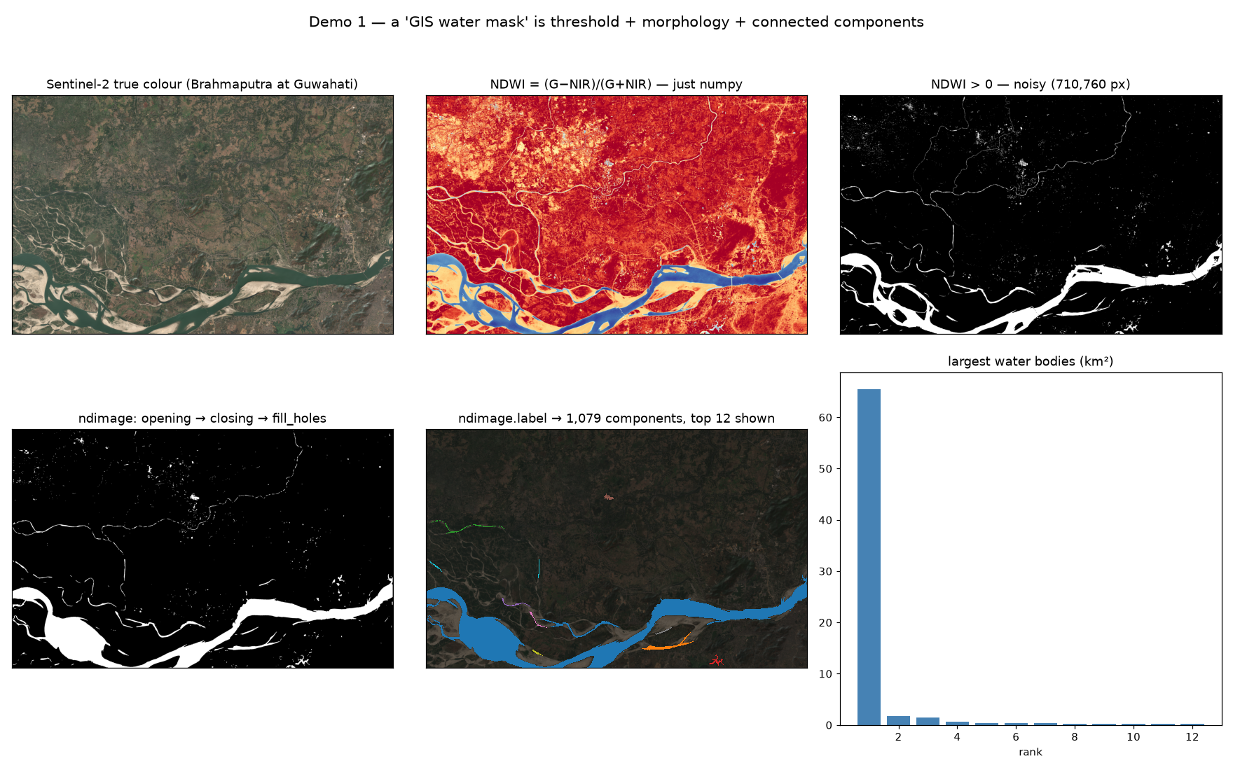
When a river floods, the first thing everyone needs to know is simple: where is the water right now? Nobody can walk around and check. The answer has to come from a satellite photo. Most people assume that pulling water out of an image needs costly software and a specialist. It actually needs a four-step recipe, and each step is about one line of Python.
When you'd use this
- The morning after a flood, when maps are needed today, not next week.
- Watching a restless river that shifts its channels every monsoon.
- Finding anything in a photo: crops, burnt ground, new construction. Same recipe, different ingredient.
- Hands-free pipelines, where the analysis runs by itself every morning with nobody clicking buttons.
How it works
Water has a habit: it swallows infrared light. Plants and soil bounce it back. So if you compare the green light and the infrared light in each pixel, the water pixels raise their hands on their own. That first pass is noisy. Wet fields blink on, ripples blink off. The cleanup is three moves with unglamorous names: opening wipes away tiny specks, closing heals small cracks, fill holes plugs the gaps. Then label gives every separate patch of water its own number, so you can count them and measure each one.
In short: wipe the noise, glue the cracks, then put a name tag on every puddle.
ndwi  = (green - nir) / (green + nir)     # water raises its hand
water = ndimage.binary_fill_holes(
    ndimage.binary_closing(ndimage.binary_opening(ndwi > 0), iterations=2))
labels, n = ndimage.label(water)          # every water body, numbered
What it means
The button in the software was never magic. It is ten lines you can read, question, and change. Once it is your code, it can run every morning on its own, and you can tune it to the mood of your river instead of trusting a default someone chose for a river far away.
Everything within 500 metres of the river (the buffer)
Why this matters
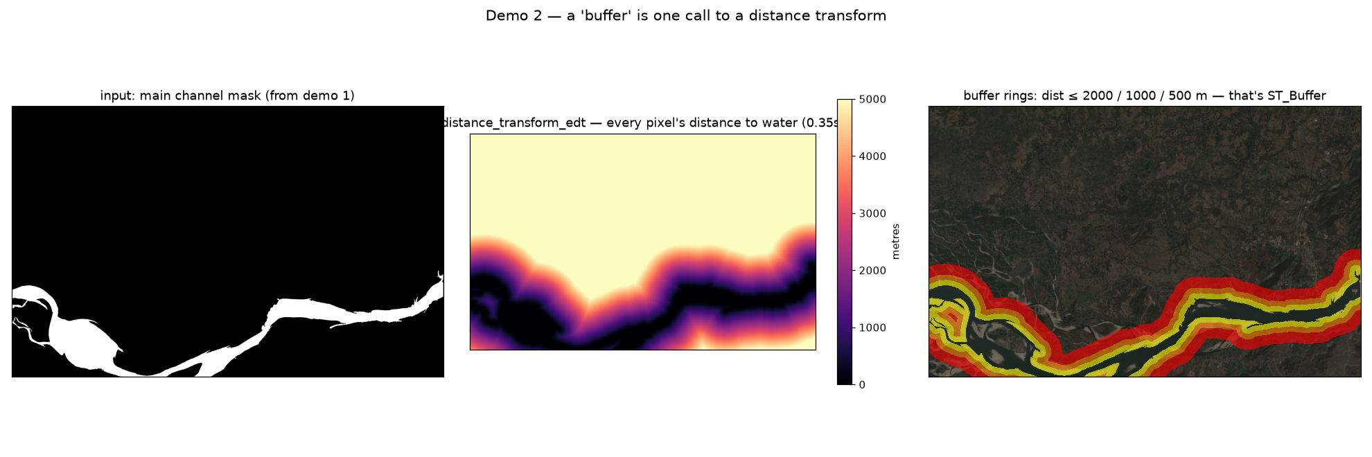
"What sits within 500 metres of the river?" may be the most common map question in the world. It decides evacuation lists, building permissions, and protection zones. In mapping software it is a button called buffer. Underneath, it is one function that measures the whole map at once, and then answers every distance you'll ever ask.
When you'd use this
- Flood danger zones: who and what lives close to the channel.
- No-construction strips along riverbanks and coastlines.
- "Distance to water" as an input for a model predicting land value or risk.
- Huge datasets, when drawing rings around millions of shapes one by one would take all night.
How it works
The distance transform walks the whole image and writes down, for every single pixel, how far it is to the nearest water. Ten million pixels, measured in a third of a second. After that, a 500 metre zone is just the question "is this number under 500?". A 2 kilometre zone is the same map asked a bigger number. No drawing, no geometry headaches.
Measure everything once. After that, every "how close is it?" question is free.
dist_m = ndimage.distance_transform_edt(~river) * 10   # metres to water, per pixel
zone_500  = dist_m <= 500                               # the buffer
zone_2000 = dist_m <= 2000                              # same map, free
What it means
Stop picturing a buffer as a ring someone draws around the river. Picture a map where every pixel already knows its distance to the water. That map is more useful than any single ring: it can feed a risk score, a price model, or the cost surface in demo four. The ring was just one question; the map answers all of them.
Which village is closest to each fire? (the nearest-neighbour question)
Why this matters
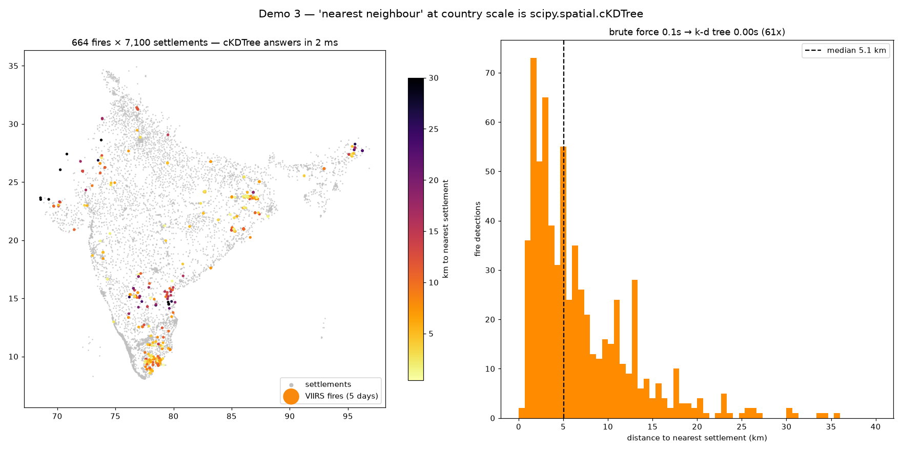
A satellite reports a fire as a dot: a latitude, a longitude, a temperature. A dot helps nobody. "Two kilometres from Jharia" helps everybody. It has a district, a fire station, a WhatsApp group. Turning anonymous dots into named places is a nearest-neighbour search, and done the obvious way, comparing every fire against every village, it gets slow fast.
When you'd use this
- Routing alerts: attach every detection to the nearest town, hospital, or responder.
- Matching two sets of points: sensors to stations, deliveries to warehouses.
- Spotting duplicates that sit suspiciously close together.
- Any time you catch yourself writing a loop inside a loop over coordinates. That loop is the tell.
How it works
Think of how a phone book works. You never read every name; you split the book in half, then in half again, and land on the page in a few moves. A k-d tree does the same thing with places: it splits the country in half, then in half again, until finding the closest village takes a handful of steps instead of seven thousand comparisons. Build it once, ask it anything afterwards. One honest warning: latitude and longitude are angles, not metres. Convert them to real distances first, or "nearest" quietly drifts as you move north.
It is the phone book trick, applied to a map. Even keeping only the fires inside India is ordinary code: draw the border, check which dots fall inside.
tree = cKDTree(villages_xy)               # build the "phone book" once
dist, idx = tree.query(fires_xy)          # 664 lookups, about 1 ms
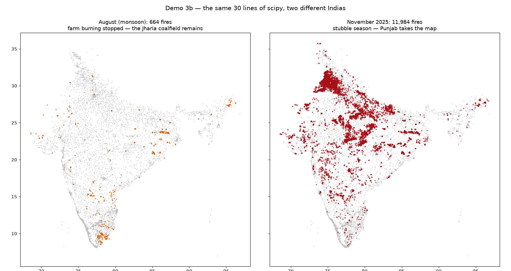
What the data volunteered on its own: it is monsoon, so farmers are not burning their fields. With that noise gone, the top of the list reads Jharia · 30, Dera Colliery Township · 27, Amlabad · 18, Jāmuria · 16. Those are coal towns in Jharkhand, sitting on seams that have been burning underground for more than a hundred years. Run the same script in November and Punjab's crop-burning season takes over the list. Same thirty lines, two different Indias.
What it means
The "spatial index" that databases build in secret is a small idea you can hold in your head. Once you know it, "find the nearest X for every Y" takes two lines and a millisecond. At that price you can afford to ask it all day, every day, for every alert that comes in.
Walking from Rishikesh to Uttarkashi (finding paths where no roads exist)
Why this matters
Google Maps needs roads. The hardest questions have none. Where should a new trail, canal, or power line go? Which villages are truly cut off, not in kilometres but in hours of climbing? To answer those, the land itself has to become the road network: every patch of ground a stop, every step between patches a connection with a price on it.
When you'd use this
- Measuring real remoteness: travel time to the nearest clinic or school, not straight-line distance.
- Laying out roads, canals, power lines across rough country.
- Reaching people after a disaster, when the roads are gone.
- Wildlife corridors: swap walking speed for animal comfort and the maths does not change.
How it works
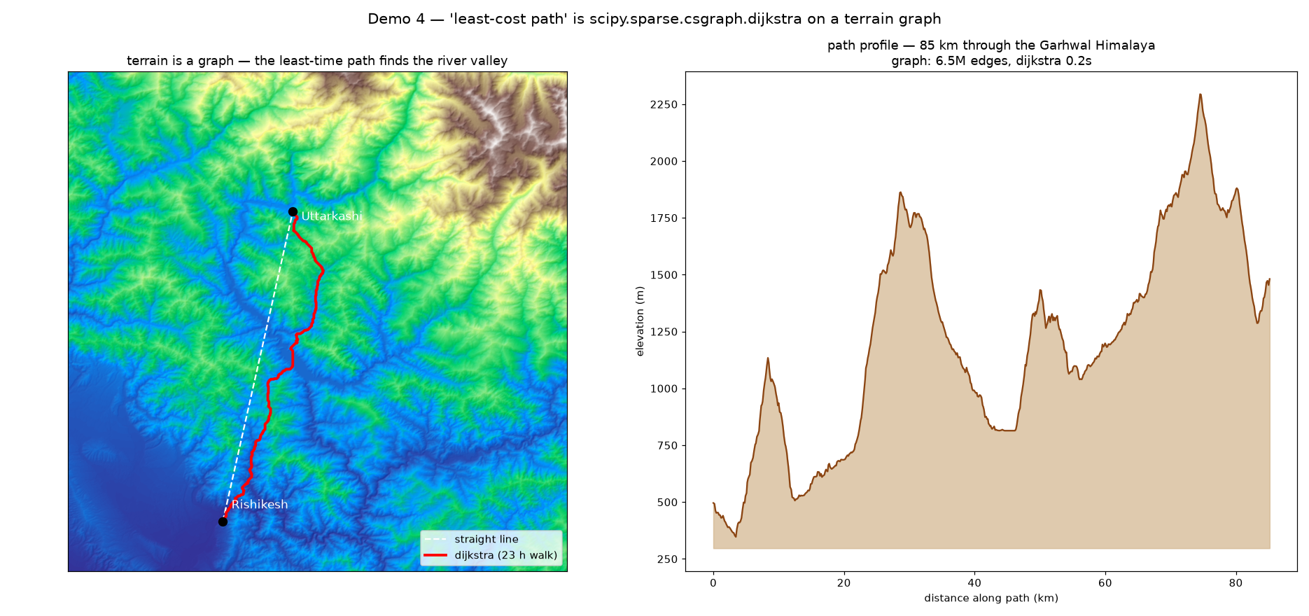
We took the elevation map of the Garhwal Himalaya and turned it into a giant price list of single steps: from this patch of ground to the next one, how many minutes would a person need? The prices come from a walking-speed rule measured by a geographer named Tobler: flat ground is quick, steep ground is slow, and uphill is slower than downhill. Then an algorithm from 1959, Dijkstra's, finds the cheapest chain of steps between two towns. It knows nothing about mountains. It just adds up small costs, very carefully, 810,000 times.
Turn the mountain into a price list of footsteps, and let a sixty-year-old algorithm plan the trek.
hours = dist_m/1000 / (6 * np.exp(-3.5 * abs(slope + 0.05)))   # Tobler's walking rule
graph = sparse.csr_matrix((hours, (src, dst)))                  # the price list
costs, pred = csgraph.dijkstra(graph, indices=start, return_predecessors=True)
What the data volunteered on its own: the fastest path refuses the straight line and follows the river valleys instead, up the Ganga and then the Bhagirathi. That is roughly where centuries of pilgrims chose to walk. The mountains had already solved this problem. The algorithm just agrees with them.
What it means
Route-finding is not about roads. It is about anything you can price per step: minutes, rupees, risk, effort. Change what the price means and the same thirty lines answer a completely different planning question. The price list is the idea. The mountain was just one example.
108 sensors, one pollution map of Delhi (filling in the gaps)
Why this matters
Sensors sit at points. People live everywhere in between. Delhi has about a hundred air quality monitors for thirty million people, which means every "pollution in your area" app you have ever opened was quietly guessing the space between stations. In mapping software that guessing hides behind a dropdown of cryptic names. The dropdown never tells you what each choice assumes.
When you'd use this
- Air quality: scattered monitor readings into a city-wide picture.
- Rainfall: a handful of rain gauges into a district-wide map.
- Groundwater: borewell readings into a picture of the aquifer.
- Anything measured at stations that you need to understand everywhere else.
How it works
The honest option connects the stations into triangles and, wherever you stand, blends the three corners around you. The result looks like stained glass: patchy, plain, and truthful about what it does not know. The pretty option places a smooth hill on top of every station and adds them all up, with a knob that decides how much to trust any single sensor. That gives the seamless surface people like to put in reports. Both are a few lines.
Here is the bug that makes the whole talk's point. We first fed the maths coordinates in degrees, and the map came out flat, as if someone had ironed it. Degrees are tiny numbers, so the maths decided that bending the surface was too expensive and handed back a ramp. Convert to kilometres and the real map appears, with north-west Delhi glowing. No dropdown would ever have told us that.
km = xy * [111.32 * cos(lat), 111.32]     # degrees → km, or the map irons flat
surface = RBFInterpolator(km, pm25, kernel="thin_plate_spline",
                          smoothing=108)(grid_km)

What it means
Every smooth map you have ever seen made assumptions: about units, about how much to trust one sensor, about what happens past the last station. Someone chose those assumptions, or worse, left the defaults on. When the guessing is your own code, you can say out loud what your map assumes, and stand behind it when it drives a real decision.
Where does the rain go? (carving the Himalaya into watersheds)
Why this matters
Rain does not care about district borders. It follows ridges and valleys. A watershed is all the land whose water drains to the same place, and it is nature's own administrative unit: floods move through it, spills travel along it, irrigation planning lives inside it. Entire software toolboxes exist just to draw these boundaries.
When you'd use this
- Dams and intakes: find every hectare that drains into them.
- Tracing a spill: which villages sit downstream of the accident.
- Watershed programmes: plan along nature's boundaries instead of survey lines.
- Far from any map: the same trick separates touching cells under a microscope, or fields in a crop survey.
How it works
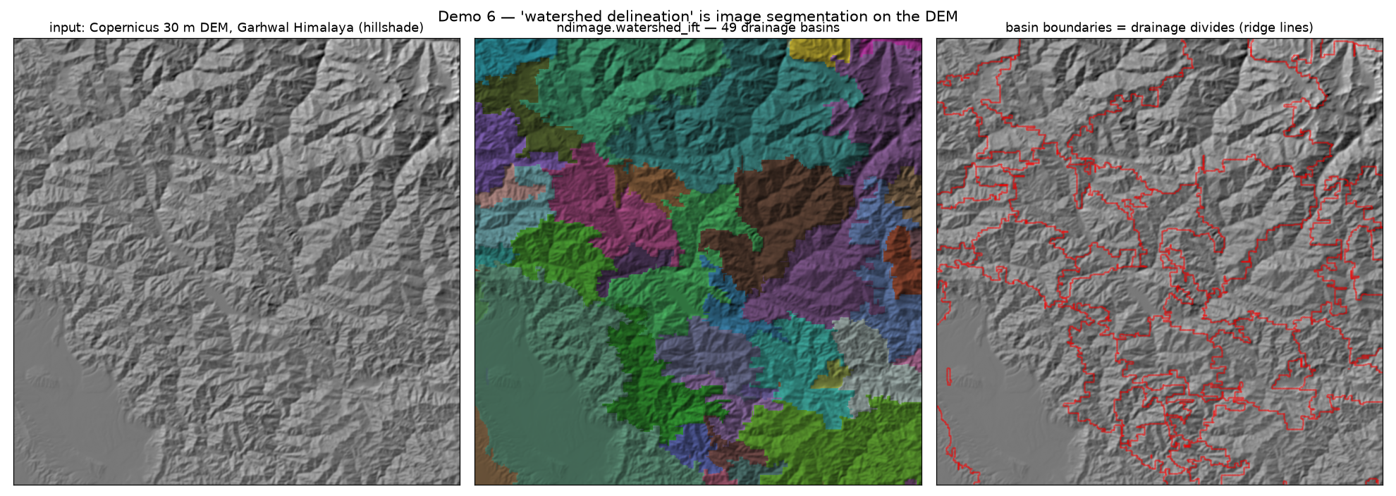
The method reads like a thought experiment. Take the terrain and imagine rain filling every valley at the same time. The puddles grow. Where two puddles are about to merge, build a wall between them. When the whole landscape is under water, the walls you built are the ridge lines, and each pool is one watershed. The only real craft is choosing where to start pouring: smooth the surface first, or every pothole on the map claims to be a valley of its own.
Pour water everywhere at once. Where the floods shake hands, that is the ridge.
seeds, n = ndimage.label(smooth == ndimage.minimum_filter(smooth, size=45))
basins = ndimage.watershed_ift(elevation, seeds)   # flood till they meet
What it means
Most Python users meet this algorithm while counting cells in biology tutorials. Pointed at the Himalaya instead, it draws real drainage basins without changing a single line. The tools do not care what the picture shows. That may be the deepest point in the whole talk.
The closing slide
None of this says throw away your GIS tools. Good tools are how work gets done. It says: know what is under them. A buffer is a distance measurement. "Nearest" is a phone book trick. A route is a price list of footsteps. A smooth map is a guess with knobs on it. A watershed is a flood in fast-forward.
Because one day your data will get too big, too strange, or too Indian for the buttons. And when the buttons run out, the simple ideas underneath are where you go.