Talk 03 · conceptual · arrays, graphs, and optimization
The Map Is a Matrix
This talk starts with a map on screen and slowly takes it apart, until only mathematics is left. Terrain becomes a grid of numbers. Towns become a cloud of points. Roads become a web of connections. A planning question becomes an equation. We solve the problems in that bare world, and only at the end does the map come back, because the map was never the thing. It is how humans look at the answer.
A mountain range is a grid of numbers
Why this matters
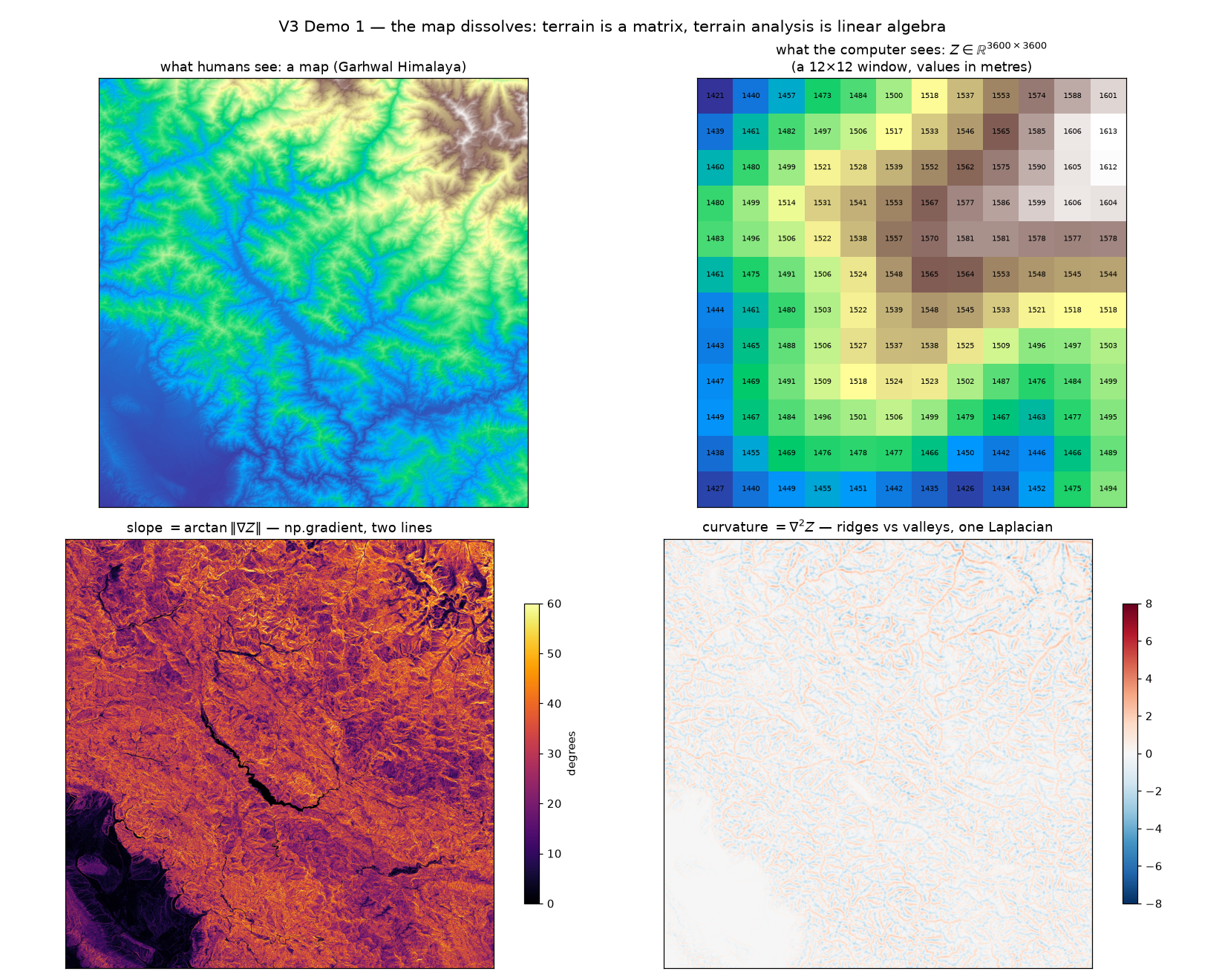
Everyone reads terrain maps: greens for valleys, browns for peaks. What the computer holds is something starker: a grid of 3600 × 3600 numbers, each one an elevation in metres. Nothing else. Every beautiful terrain product you've seen, every shaded relief and slope map, was arithmetic on that grid.
What falls out for free
- Slope: how quickly neighbouring numbers change. One gradient call.
- Ridges and valleys: whether a point sits above or below its neighbours' average. One more call.
- Shaded relief: pretend the sun is at 315°, take a dot product. That's the "3D look".
- Anything you can write as arithmetic on a neighbourhood.
The dissolve moment
The figure below does the reveal. Left: the Garhwal Himalaya as a map. Right: a tiny 12×12 window of the same file, shown as its actual numbers. That's the whole trick of the talk, done once, slowly: the map and the matrix are the same object wearing different clothes. Once you accept that, "terrain analysis" stops being a toolbox and becomes two lines of numpy.
Steepness is how fast the numbers change. Ridges are where they curve. The rest is presentation.
dy, dx = np.gradient(Z, 30.0)                    # how fast heights change
slope  = np.degrees(np.arctan(np.hypot(dx, dy))) # that's a slope map
curv   = ndimage.laplace(smooth(Z))              # ridges vs valleys
What it means
If terrain is a matrix, then every skill you have with arrays — slicing, convolution, statistics — is already a GIS skill. You knew more geography than you thought.
Towns are a cloud of points, and the cloud has structure
Why this matters
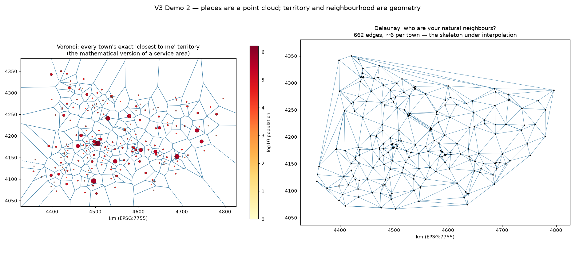
Drop every town in Bihar onto empty space: just dots, no map. Two ancient questions immediately have exact answers. "What territory is closest to each town?" That's a Voronoi diagram, the mathematically perfect version of a service area. "Who are a town's natural neighbours?" That's a Delaunay triangulation, the web you'd get if every town shook hands with the towns around it.
When you'd use this
- Service areas without arbitrary radius circles: coverage that tiles perfectly.
- Fair comparisons: compare each town with its actual neighbours, not the whole state.
- Gap-finding: big Voronoi cells are the underserved places.
- The skeleton under interpolation: talk one's stained-glass surface was standing on this web.
How it works
Both structures come from one geometric fact: for any spot, some town is closest. Draw the fences where "closest" changes hands and you get Voronoi cells. Connect towns whose fences touch and you get Delaunay's web. SciPy computes both exactly, for 226 towns, in milliseconds. No buffering, no trial radii, no GIS.
Voronoi answers "whose turf is this?" Delaunay answers "who do you actually border?" Every siting argument needs both.
vor = Voronoi(town_xy)      # exact territories
tri = Delaunay(town_xy)     # natural neighbours: 662 edges
What it means
"Service area" and "neighbouring town" sound like planning vocabulary, but they are geometric objects with exact definitions and instant algorithms. When the words become geometry, the arguments become checkable.
Networks are graphs: design one, then measure a real one
Why this matters
Once places are points, connection becomes a separate, precise thing: a list of links, each with a cost. Mathematicians call it a graph. The payoff is that one abstraction serves both directions of thought: designing a network that doesn't exist yet, and measuring one that does.
The two directions
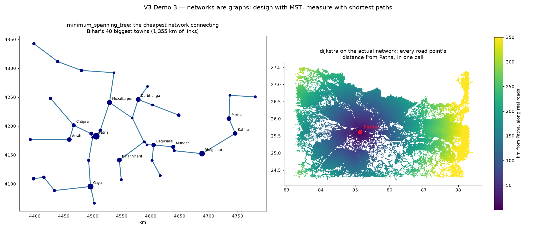
- Design: the minimum spanning tree is the cheapest set of links that connects everyone. It's how you'd sketch a new rail or fibre network on a napkin, exactly.
- Measure: shortest paths over the real 11-million-point road network say how far every place truly is from Patna, along actual roads.
What happened
Design first: connecting Bihar's 40 biggest towns needs just 39 links and 1,355 km of line, computed instantly. That number is a floor: any real network will be longer, and now you know by how much. Then measurement: one call walks the entire real road network out from Patna and stamps every one of 11 million road points with its true road distance. Median: 144 km. The same abstraction, pointed backwards.
A graph doesn't care whether its links are proposals or asphalt. Design and audit are the same mathematics.
mst = minimum_spanning_tree(distances)          # cheapest way to connect 40 towns
cost = dijkstra(road_graph, indices=patna)      # true distance to 11M points
What it means
Napkin sketches and network audits usually live in different professions. As graphs they are two calls in the same library, and you can hold a proposal and reality up against each other with numbers instead of adjectives.
"Where should the next five facilities go?" has an exact answer
Why this matters
Siting decisions — hospitals, warehouses, fire stations — are usually made by committee intuition: put them in the biggest cities. But "place 5 facilities so the average person travels least" is a well-posed mathematical problem. Not approximately. Exactly. And for realistic sizes, SciPy solves it in under a second.
When you'd use this
- Public facilities: clinics, schools, shelters, testing centres.
- Logistics: depots and dark stores against demand maps.
- Budget arguments: "the optimal plan is 12% better" is a sentence committees respond to.
- Every siting debate currently settled by whoever speaks loudest.
What happened
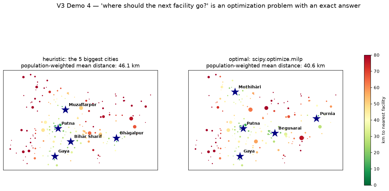
We gave the solver Bihar's 226 towns with their populations, 40 candidate sites, and one instruction: pick 5 so the population-weighted travel distance is as small as possible. The intuitive answer, the 5 biggest cities, scores 46.1 km per person. The optimizer's answer scores 40.6 km: 12% better. And its picks are the interesting part. It keeps Patna and Gaya, then ignores the next biggest cities and chooses Purnia, Begusarai and Motihari, because they cover the north and east that population rankings forget. Solve time: 0.2 seconds.
The committee optimizes for cities it can name. The equation optimizes for people, including the ones far from the microphone.
res = milp(c=weighted_distances, constraints=[assign_once, open_exactly_5, linking],
           integrality=all_binary)              # exact answer, 0.2 s
What it means
Some of the most consequential map questions aren't map questions at all. They're optimization problems wearing a map as a display. When you can state the goal as an equation, you can know you found the best answer, and say so with a straight face.
The map comes back
Four acts, four translations: terrain into a matrix, towns into a point cloud, roads into a graph, a policy debate into an equation. In each one the map disappeared, the problem got solved in the bare mathematics, and the map returned only at the end, as the picture of the answer.
A GIS is not fundamentally a map. It is a collection of computational representations of space. The map is how humans look at the answer — and once you know what's underneath, you can change the answer before you look at it.